Západočeská galerie (West Bohemian Gallery), Plzeň
2009, public competition
| Team: | Pavel Dvořák, Petr Eliáš, Lenka Musilová, Petr Pelčák, David Vahala |
| Commissioner: | Plzeň Region |
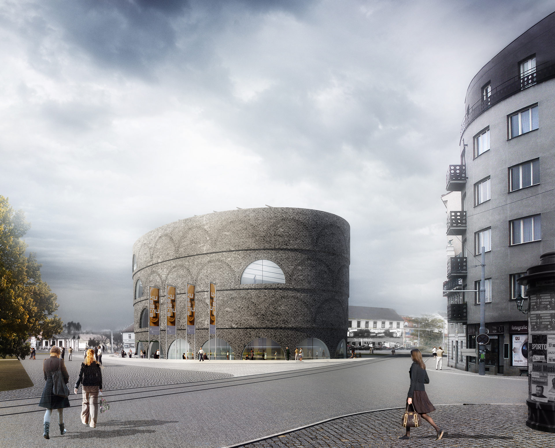
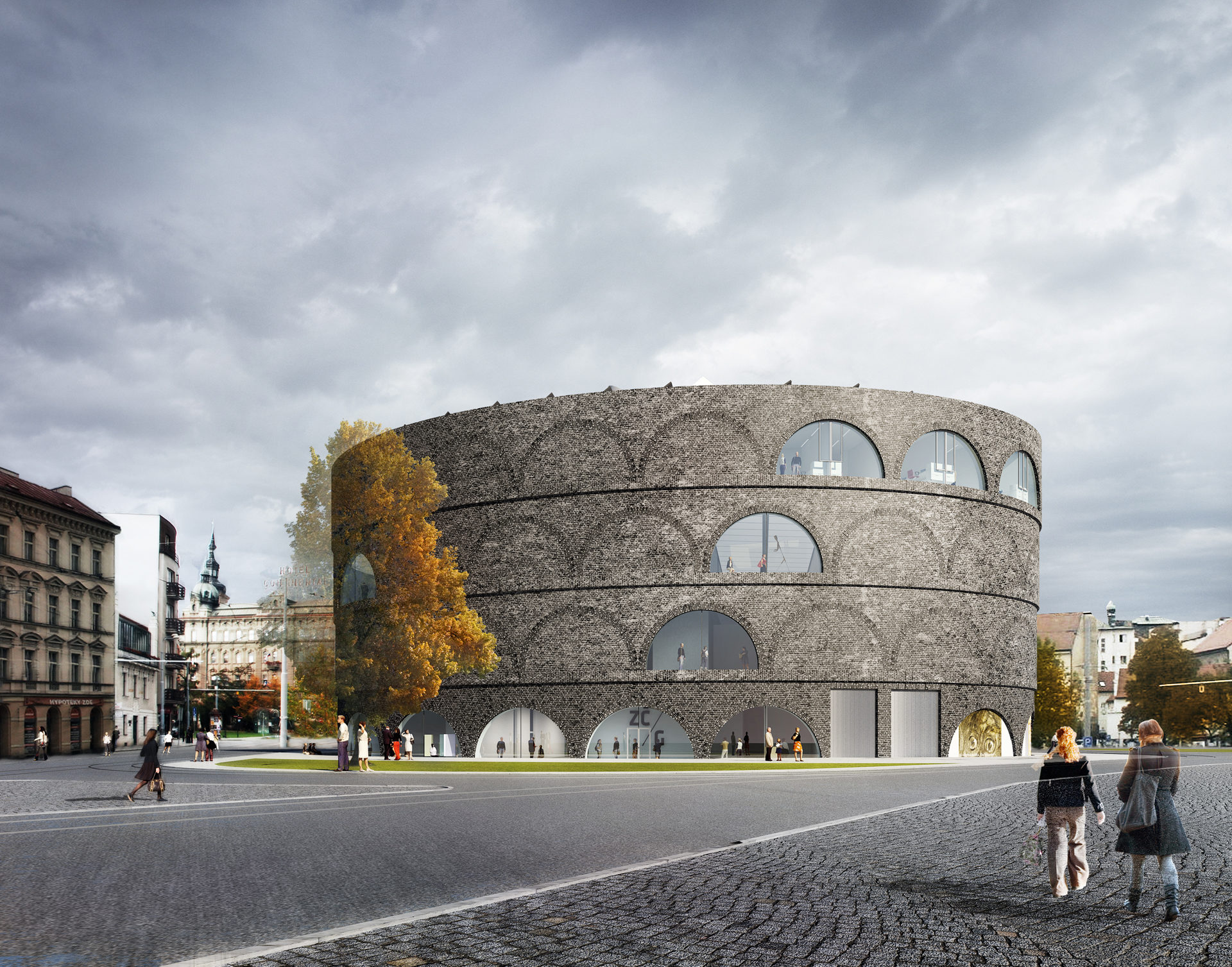
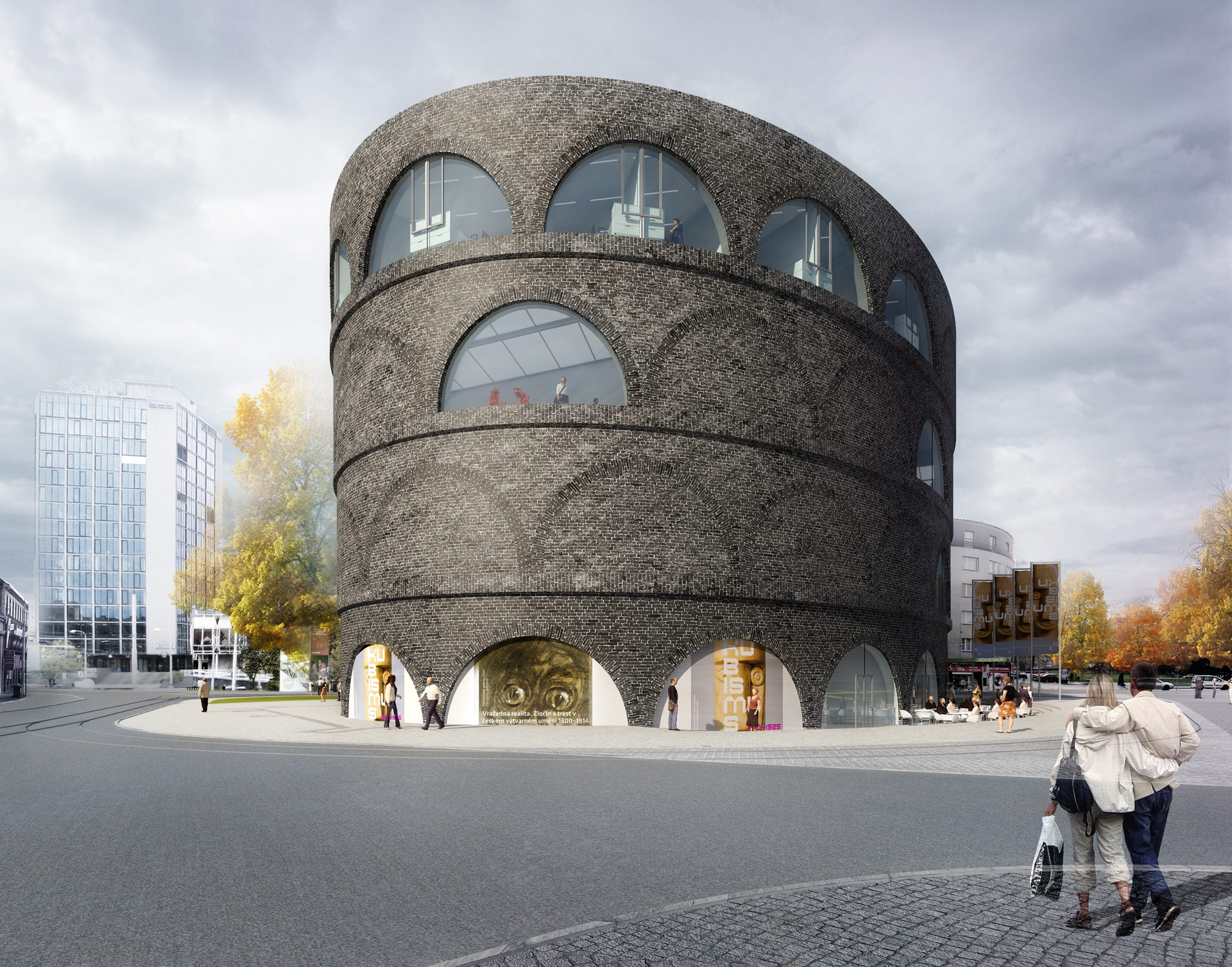
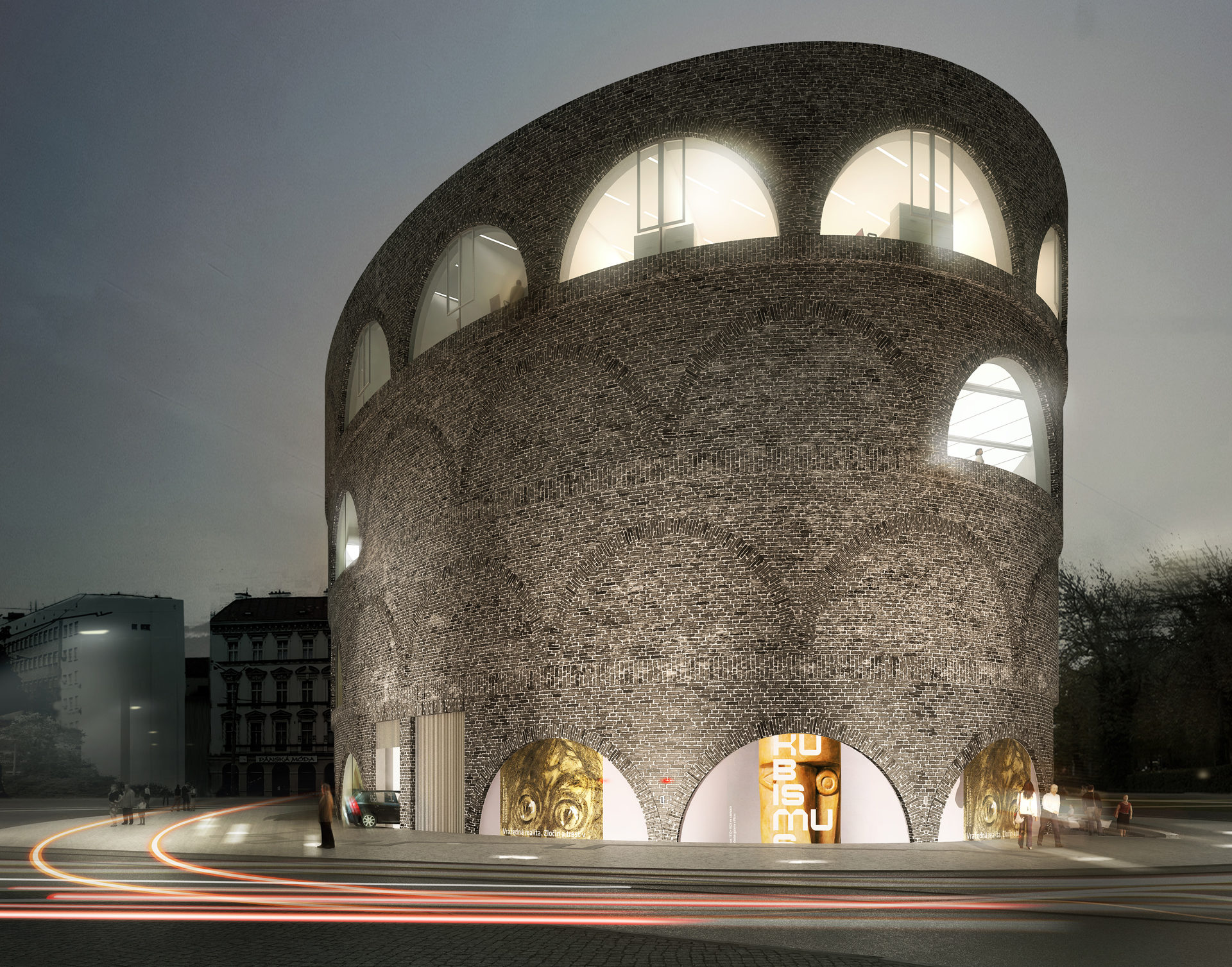
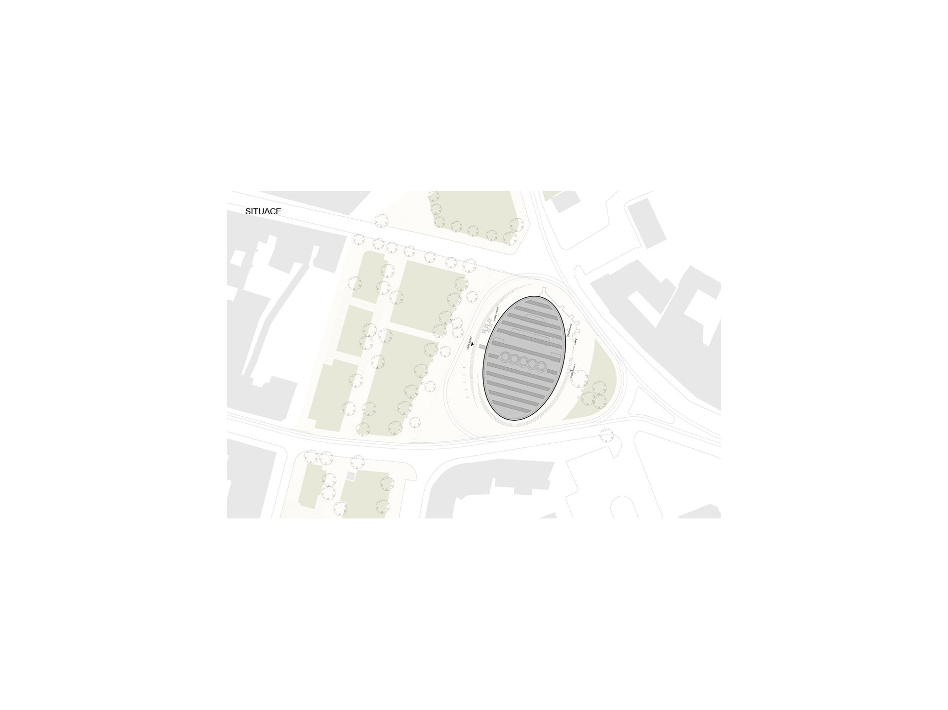
The oval volume of the gallery in its particular city planning position, serves to create this “cultural Piccadilly” of Plzeň. It has a curved facade guiding the stream of traffic as well as the incohesive city planning links within the area. The entrance to the gallery opens up to the city. The mass, closedness and succinctness of the structure serve as answers to the loud and busy in terms of traffic surroundings and the need for concentration on the inner world of the visual arts as well as the need to create for it, by means of simple construction means, a calm, permanent and safe internal environment.
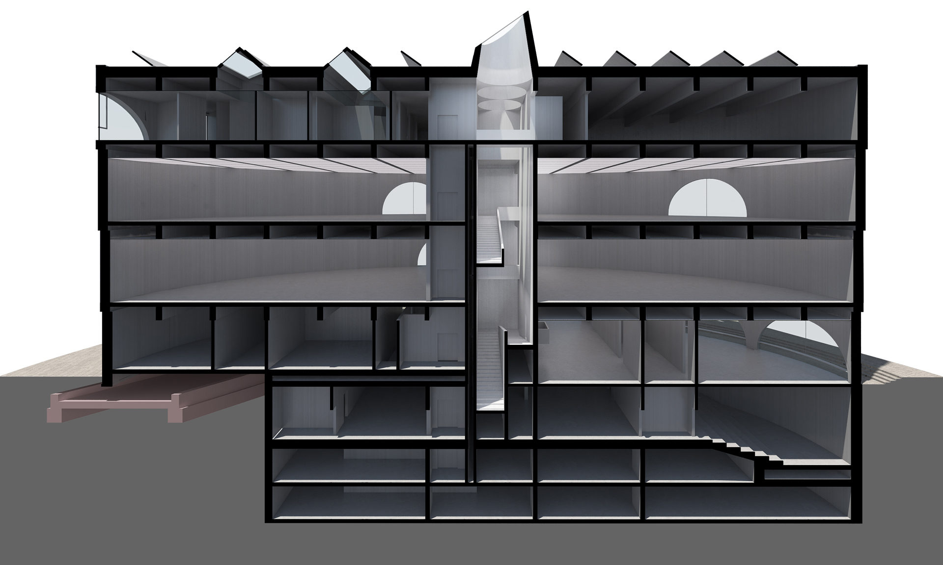
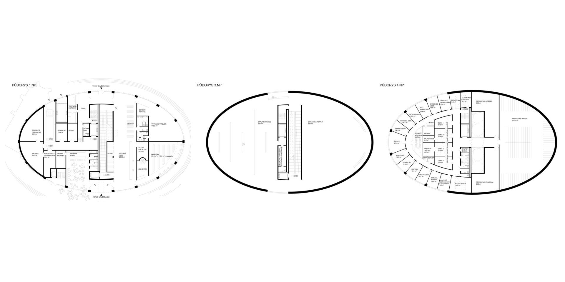
The design for the gallery arose out of three main ideas. The first was to create a structure from elementary construction elements. The only vertical load-bearing construction is therefore the facade along the circumference and the communication core in the centre. The horizontal construction consists of thin plates on prestressed girders. Their height makes possible ideal lighting of the exhibition spaces as the basic LED light sources are situated in the lower face of the ceilings at a sufficient distance from the area-wide ceiling structure from white organic glass in the face of the bottom edge of the girders.
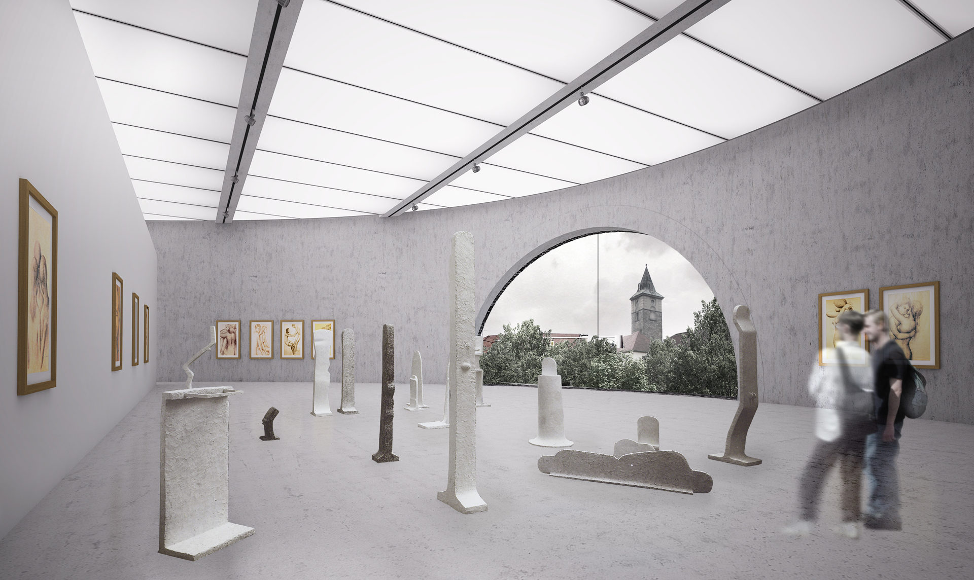
The second idea behind the design is to create a calm introverted environment for exhibition spaces in order to enhance to a maximum extent the impact of the works of art. It also wants to provide visitors with a dramatic spatial and architectural experience. The horizontal and artificially lighting of the hall exhibition floor is therefore vertically linked with the narrow, heightened communication core with direct, upper lighting and with ramps of escalators. The quiet, closed with a curve horizontality of the particular floors is supplemented by the dramatic verticality of the sharp edges and the lights on the paths in between them.
The third basic intention was to create a gallery combining views of visual art pictures with views of city pictures and thus enhance the relationship between the viewer and art and the place, the city. The most attractive views of the city are therefore framed with large openings into the interior. These large windows can be closed with internal blinds so as not to disturb the exhibition.
The concept behind the design is focused on minimizing energy consumption and the quality of the internal environment. The heat and cold source is a system of heat pumps earth-water situated in the engine room in the basement of the structure. The heat pumps are designed to cover the production of 95% of all of the energy for heating and cooling the structure.
Photovoltaic panels for direct transformation of sunlight into electric energy, which will be consumed from 95% in the structure, are installed on the roof of the building.
The aesthetics of the design make use of the motifs of curves and arches, this actually being the design of the concrete and brick construction. The reinforced concrete load-bearing core of the structure has a sandwich facade with a surface from black facing brick with a wider chink in the white mortar which is not jointed but spread over the surface. The final black and white surface on the one hand lends the structure a motif of classic exhibition, not only familiar but also akin to the scale of brick masonry, and on the other hand lends it a succinct shape and tectonic theme moving toward a certain archetypal needed level of abstraction. The colour of the bricks is also, however, a response to the black facades of the neighbouring buildings symbolizing the spiritual and practical life of the city (the Church of St. Bartholomew, the town hall, the water tower) and consequently the gallery is placed into the city context by means of the colours of the facade.
