Brno New Main Train Station
Jižní čtvrť, Brno
2020 – 2021, international two-phase restricted competition, 2nd place
In cooperation with Thomas Müller Ivan Reimann Architekten, Berlin
| Team: | Jakub Czapek, Richard Čech, Daniel Gášek, Jakub Hanžl, Jan Kozák, Thomas Müller, Filip Musálek, Petr Pelčák, Ivan Reimann, Jan Sochor, Richard Sukač, David Vahala, Miroslava Zadražilová |
| Investor: | Railway Administration and Statutory City of Brno |
| Transportation: | Atelier DPK, s.r.o. |
| Structure and MAP: | Arup Deutschland GmbH, Berlin |
| Landscape architecture: | Vogt Landschaftsarchitekten AG, Zürich |
| Rendering: | Atelier Brunecky |
| Animation: | Mangoshake Studio |
| Architecture model: | Archimage |
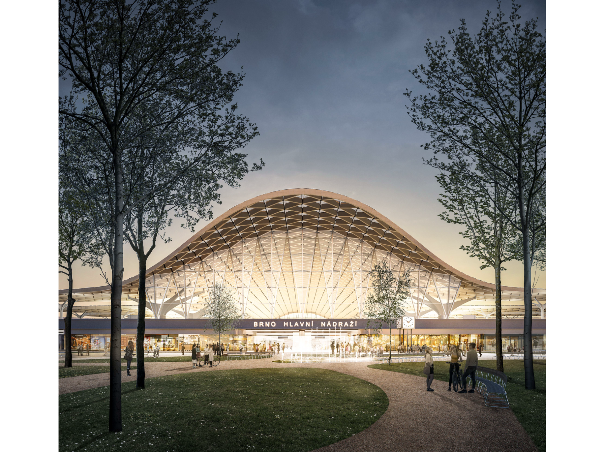
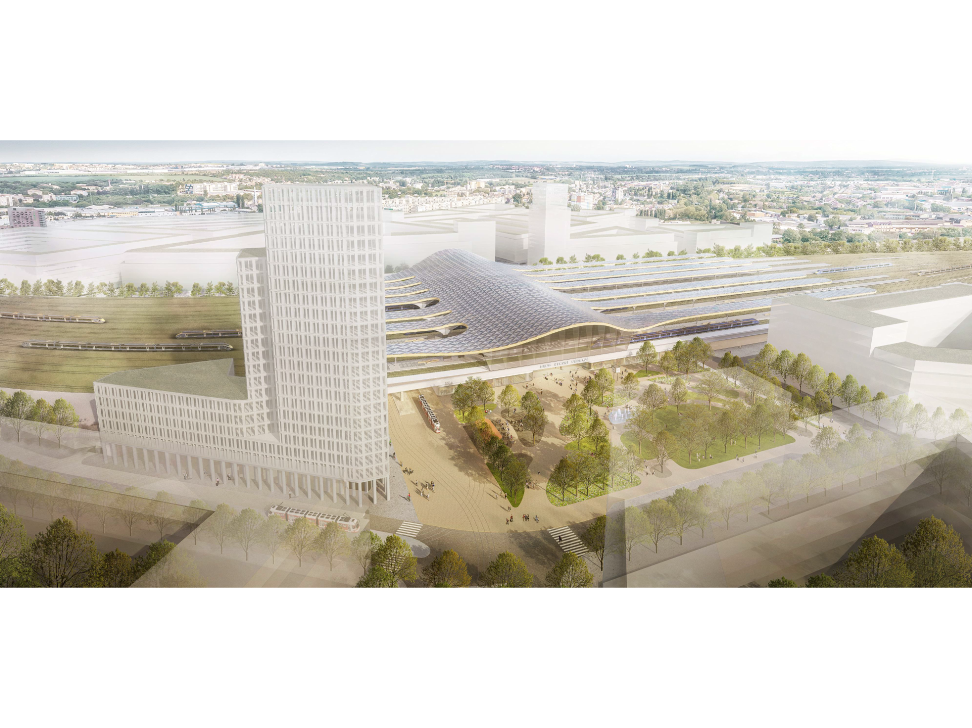
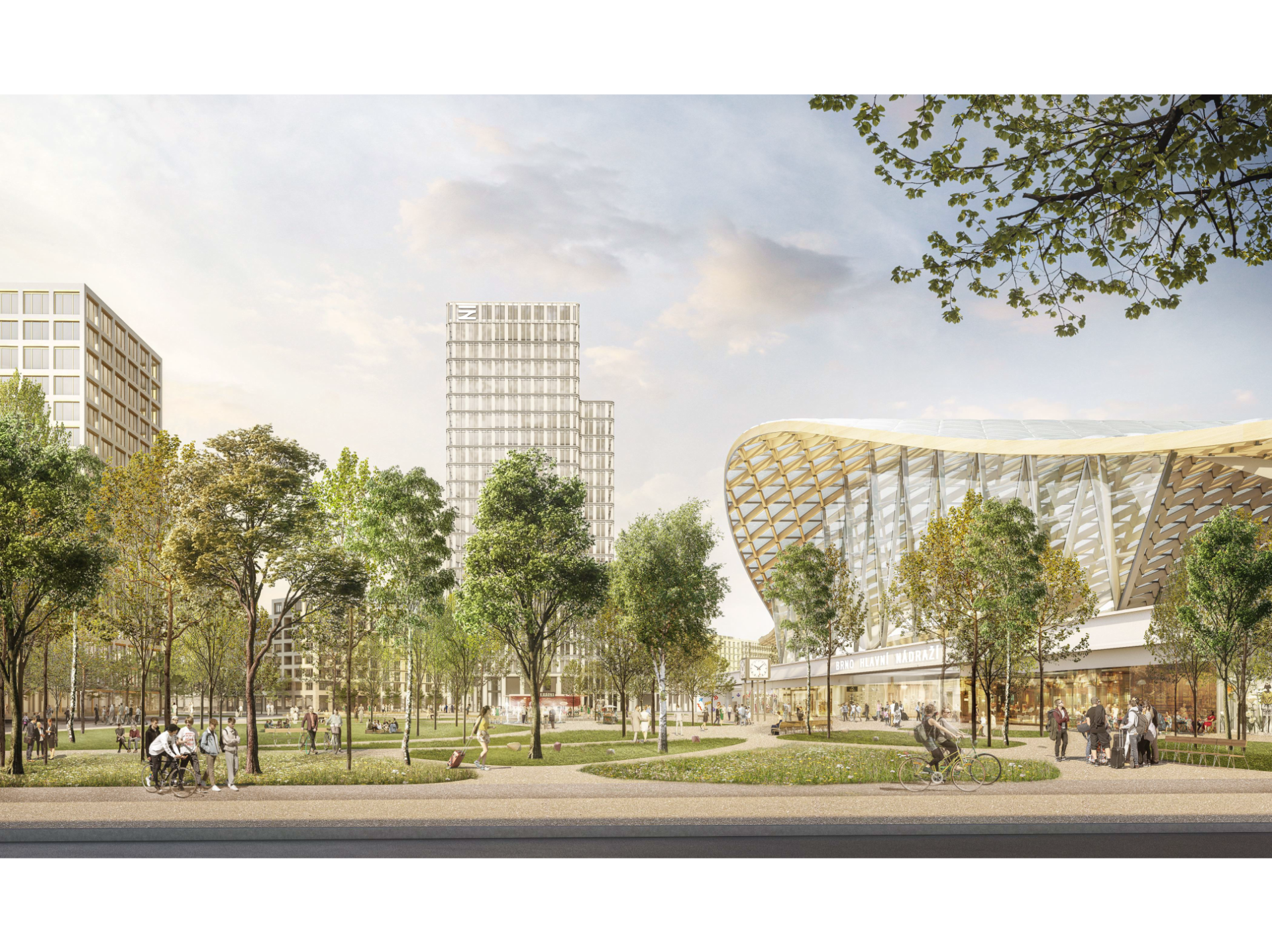
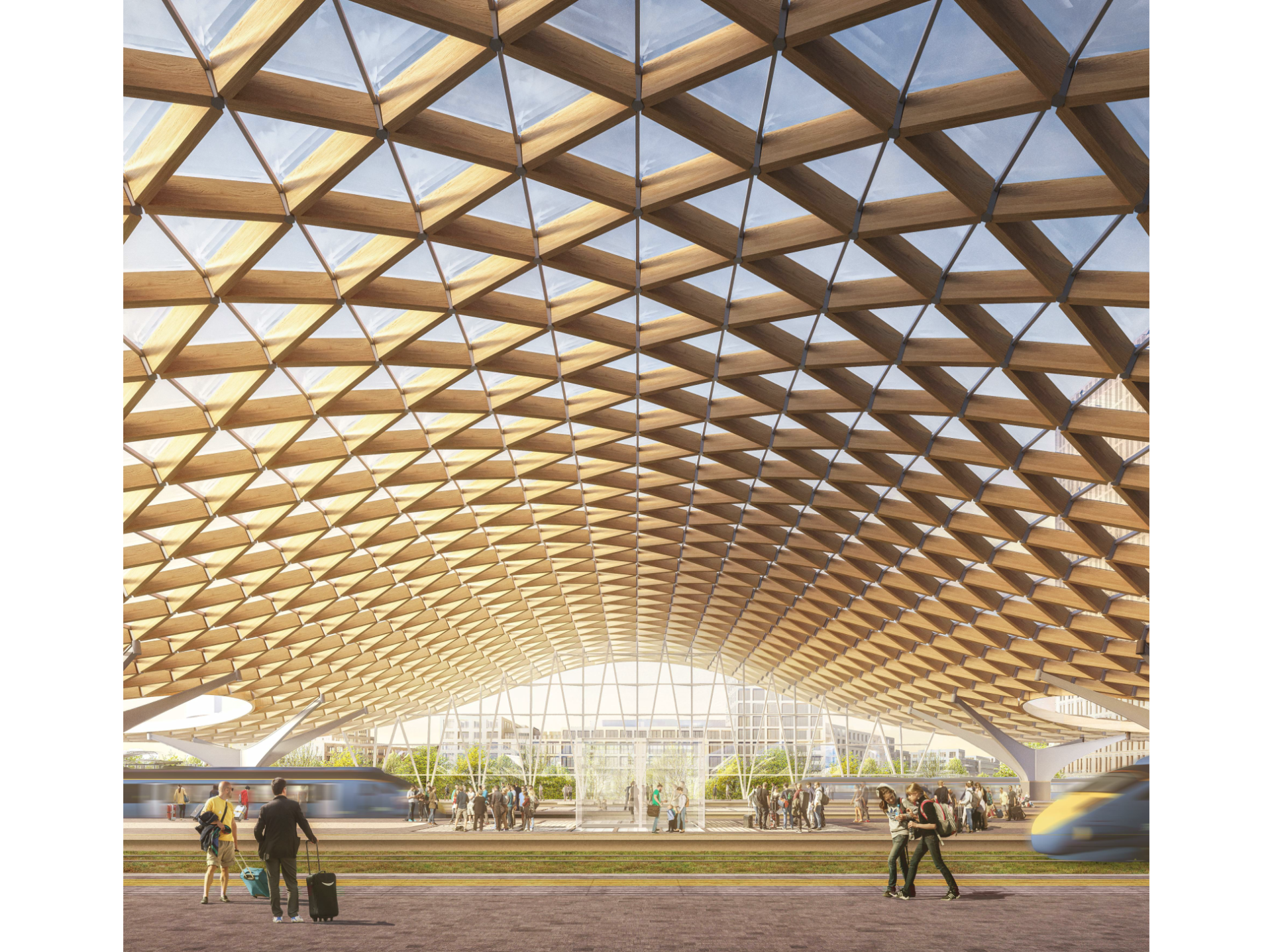
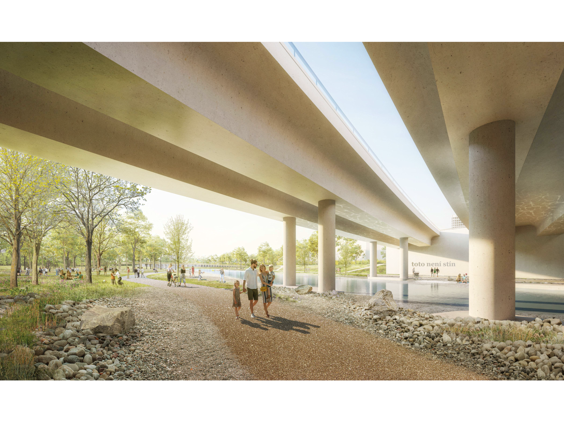
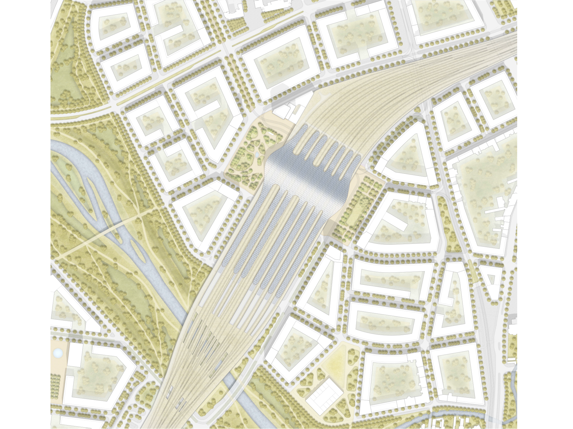
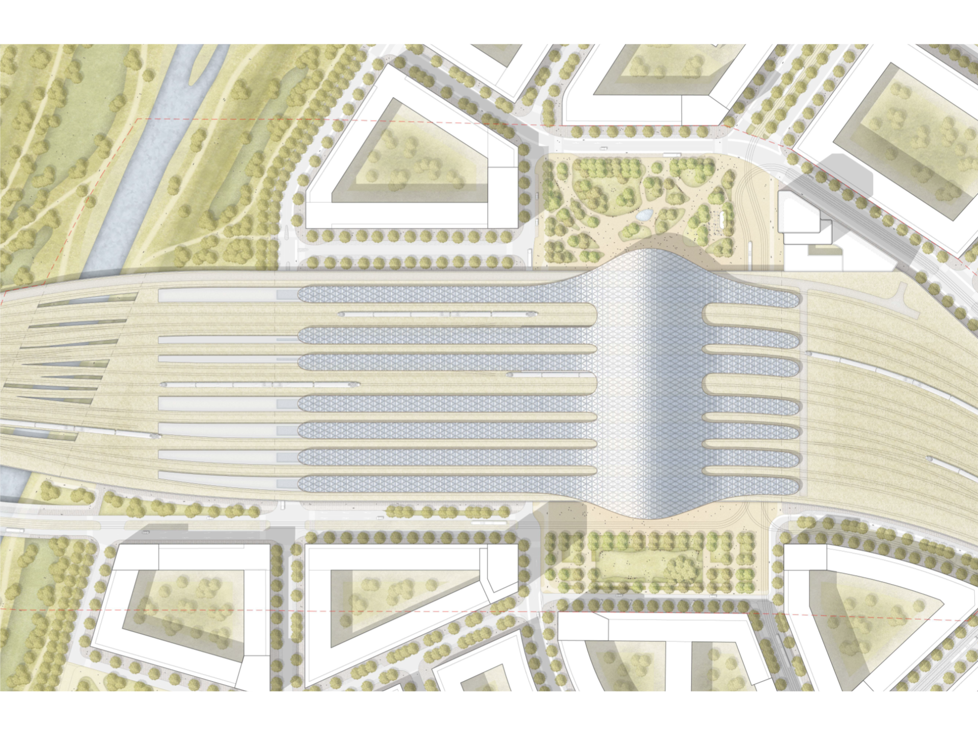
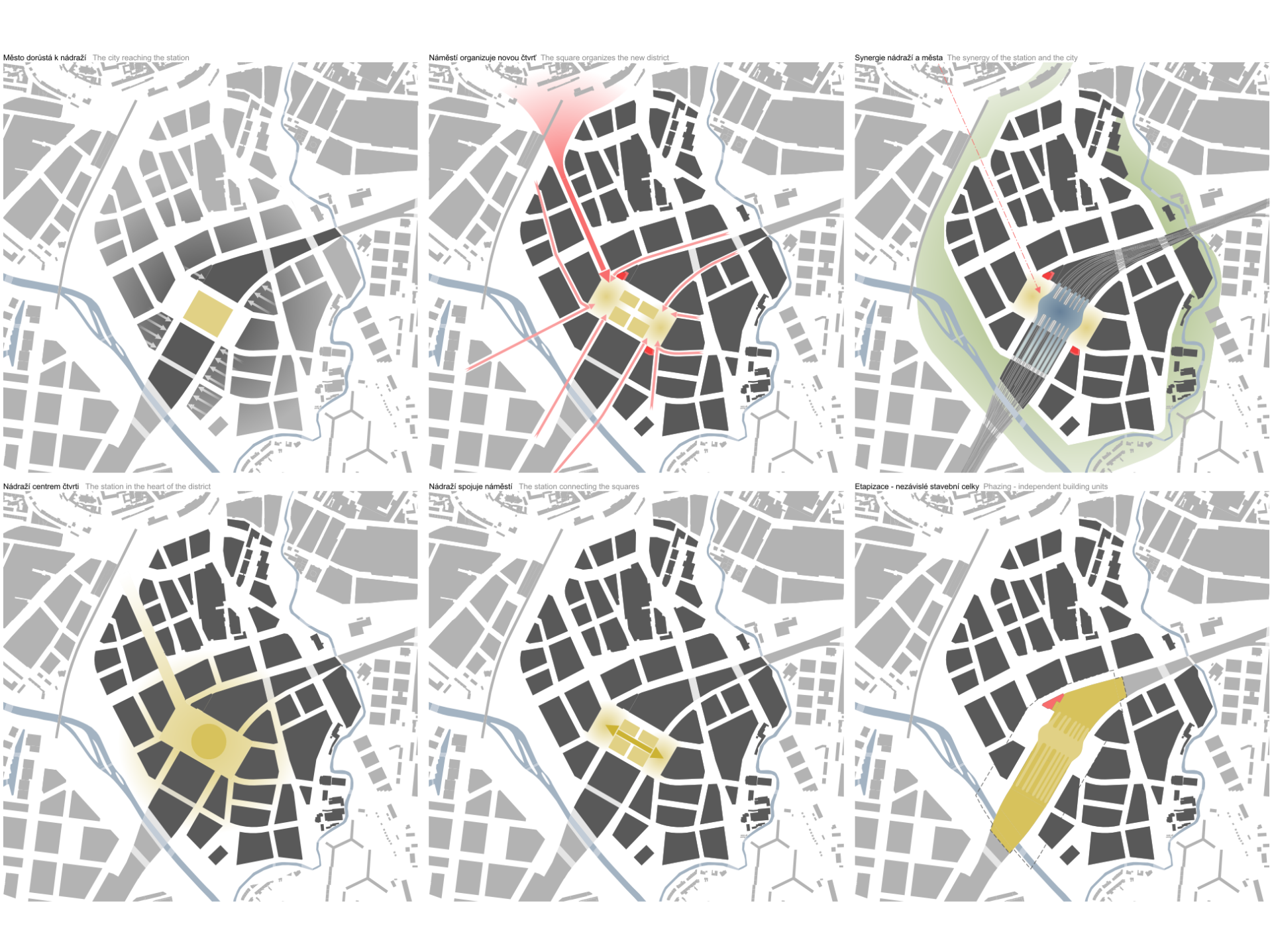
The new Brno district built on the principle of urbanism of European cities integrates the station into both the territory and history of Brno. The station does not merely neighbor the landscape along Svratka and the traffic node, but they constitute an urban complex. They form a single organism, which they are a part of – teammates sharing the mutually generated energy. At the same time, its frame is simple yet robust, and as such it can adapt to the needs of Brno’s future development, which we do not even know today.
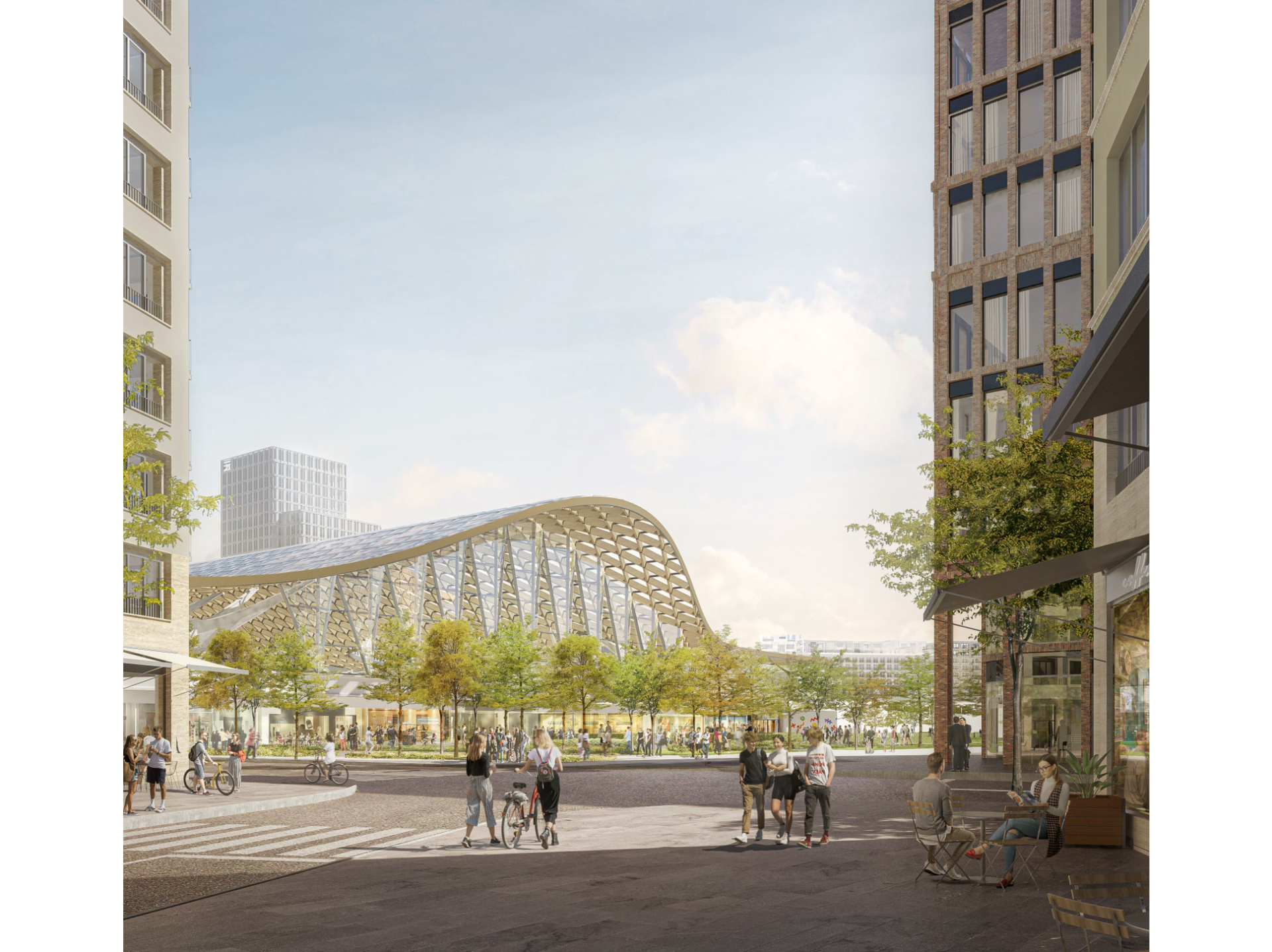
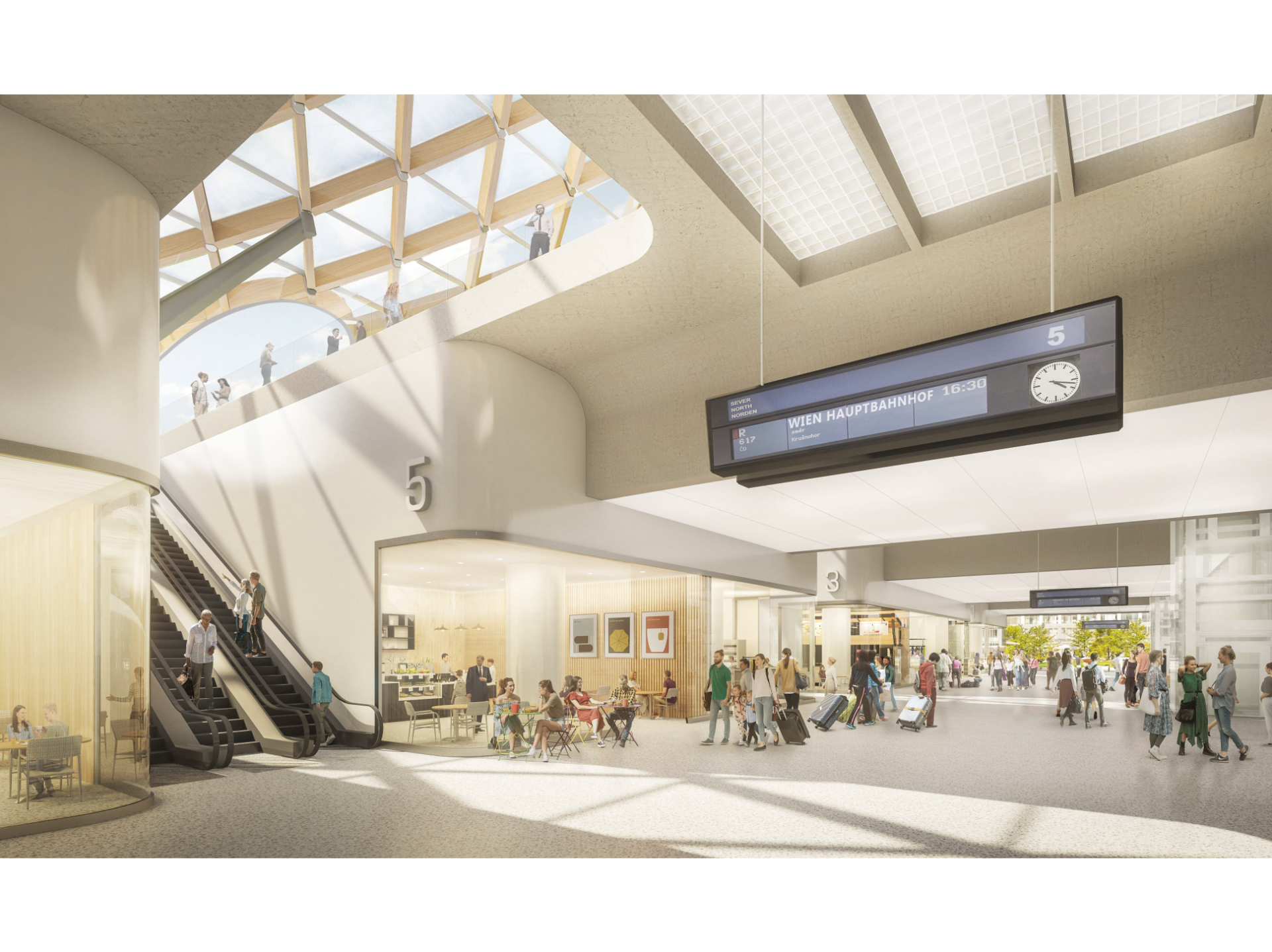
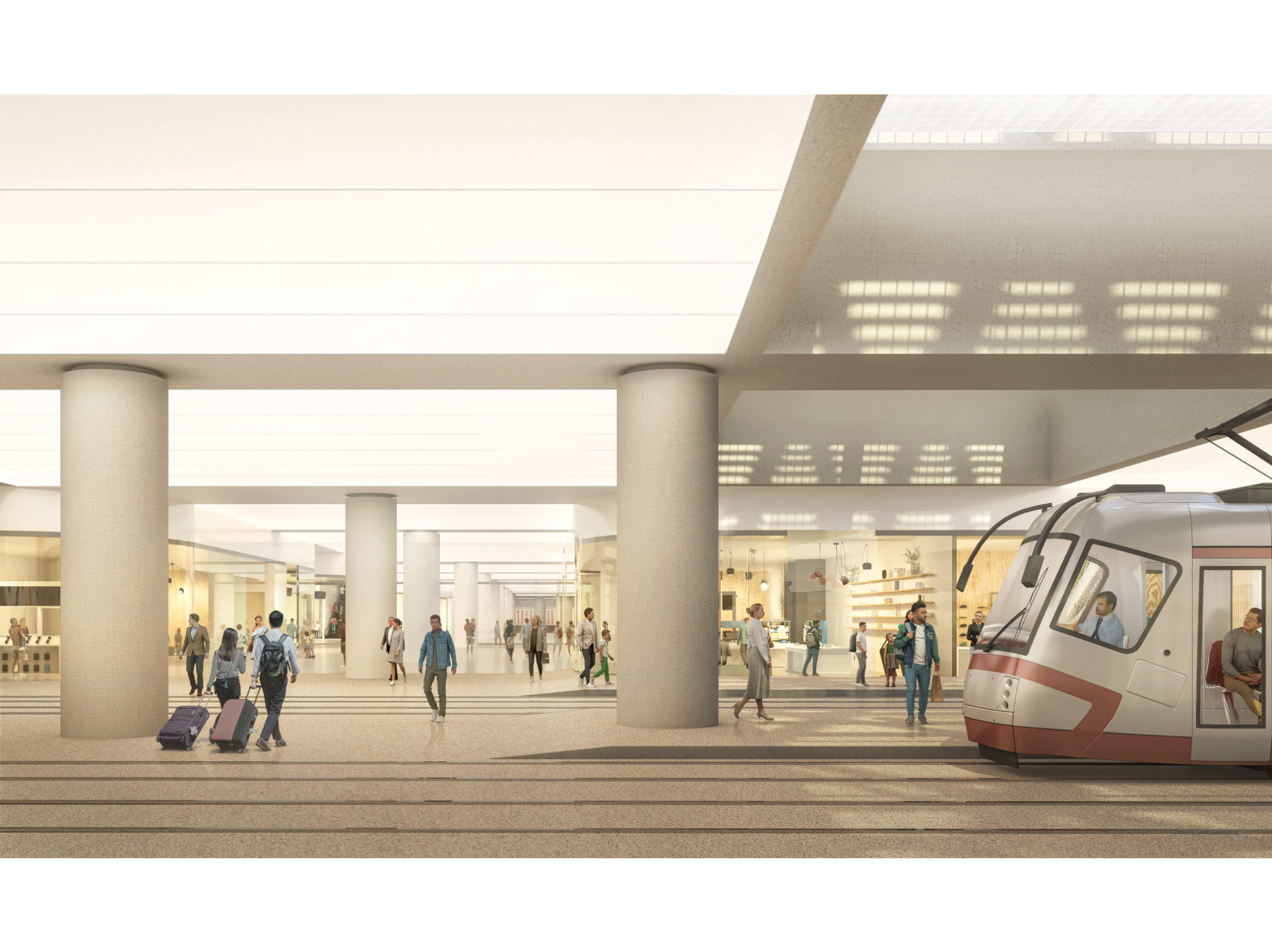
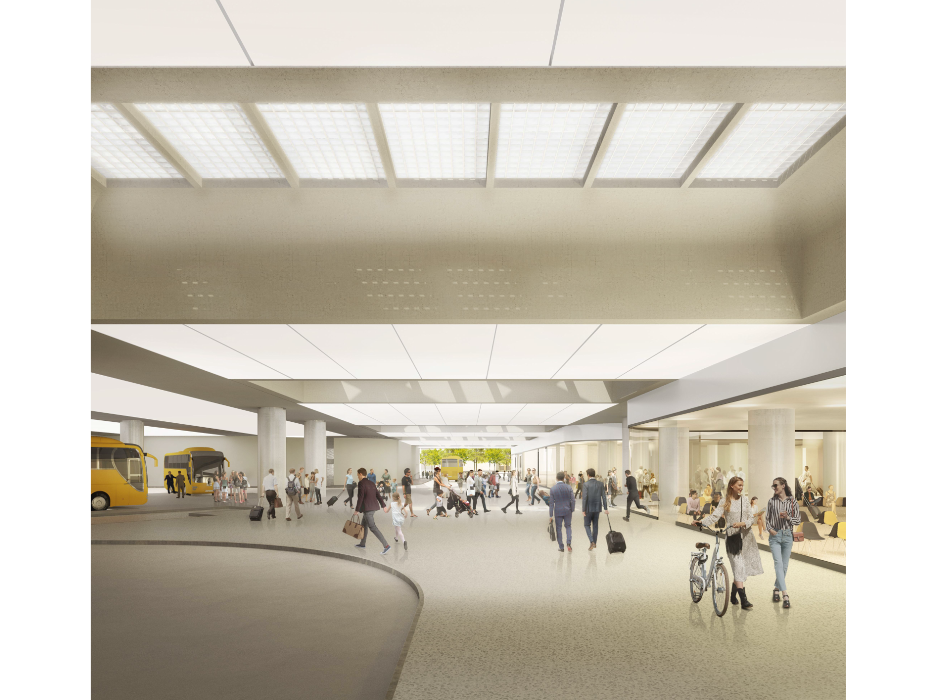
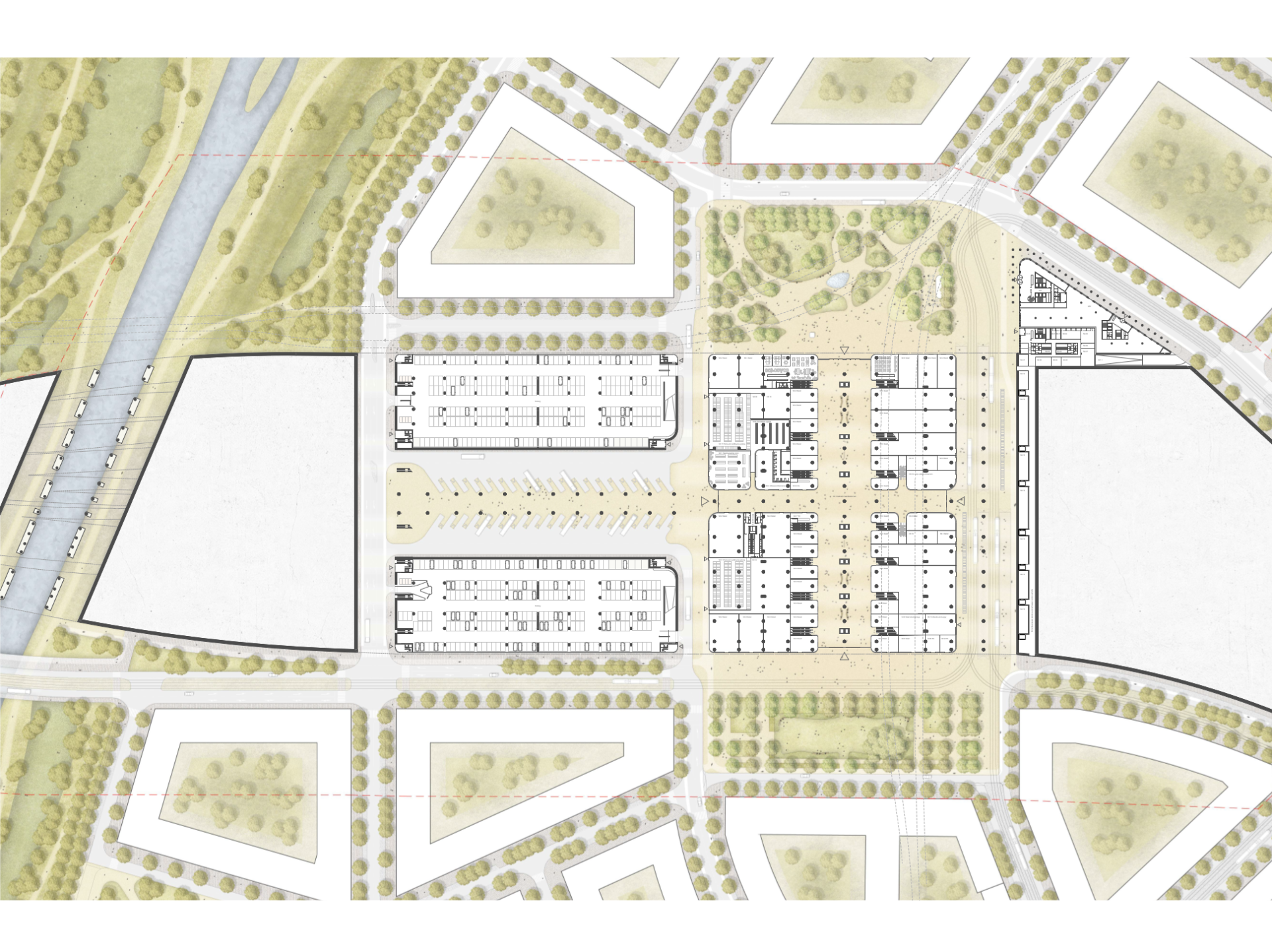
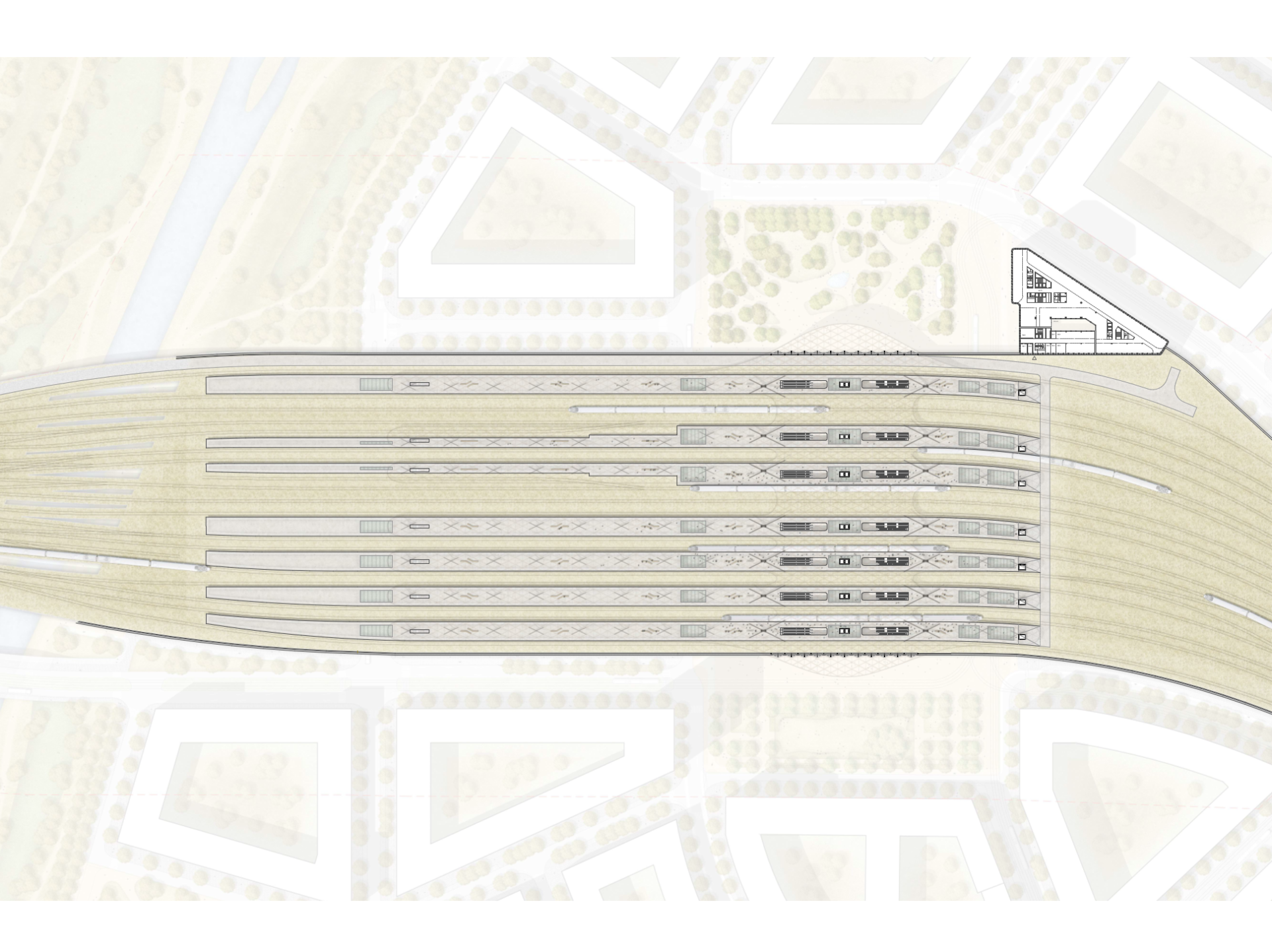
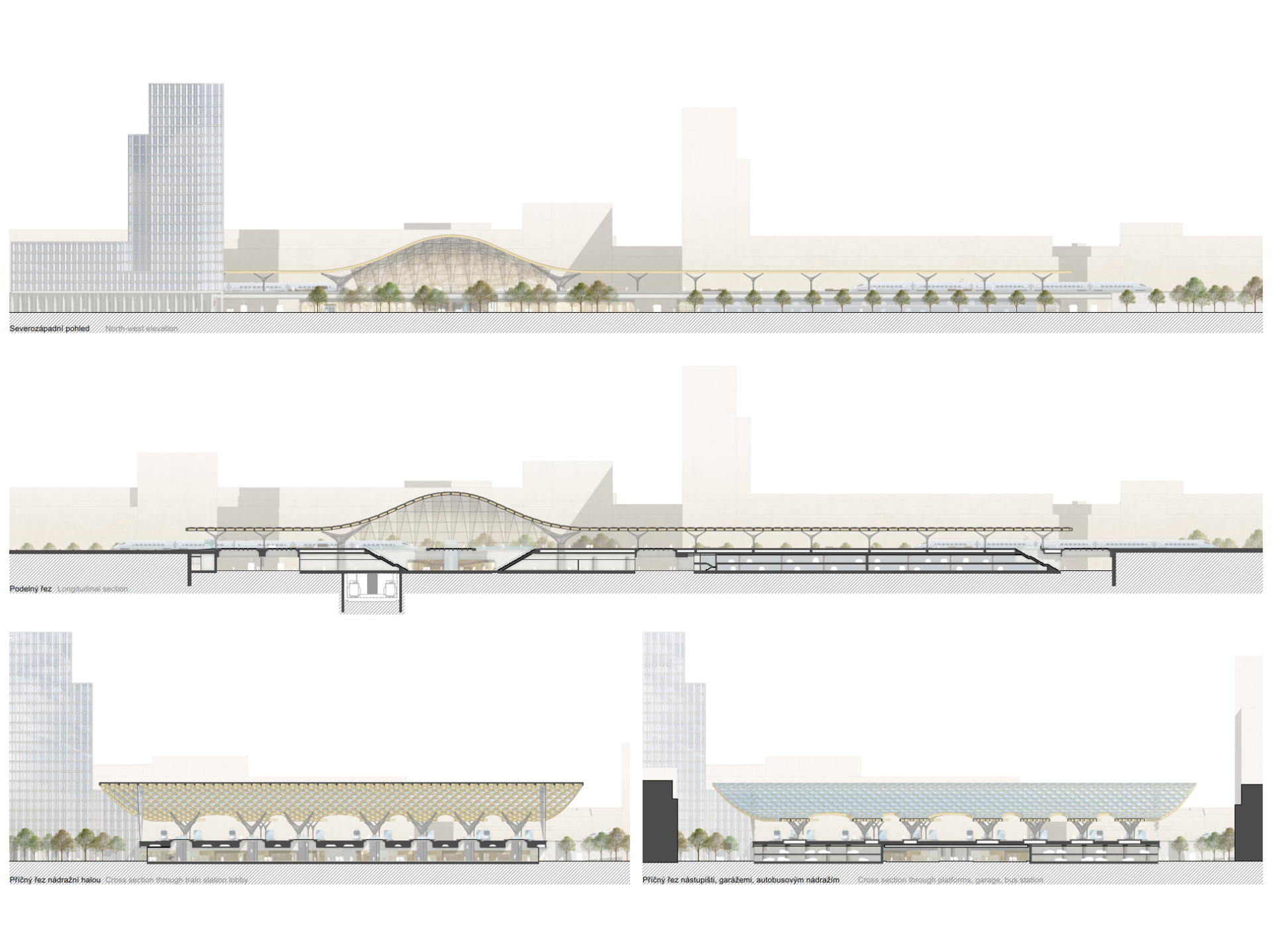
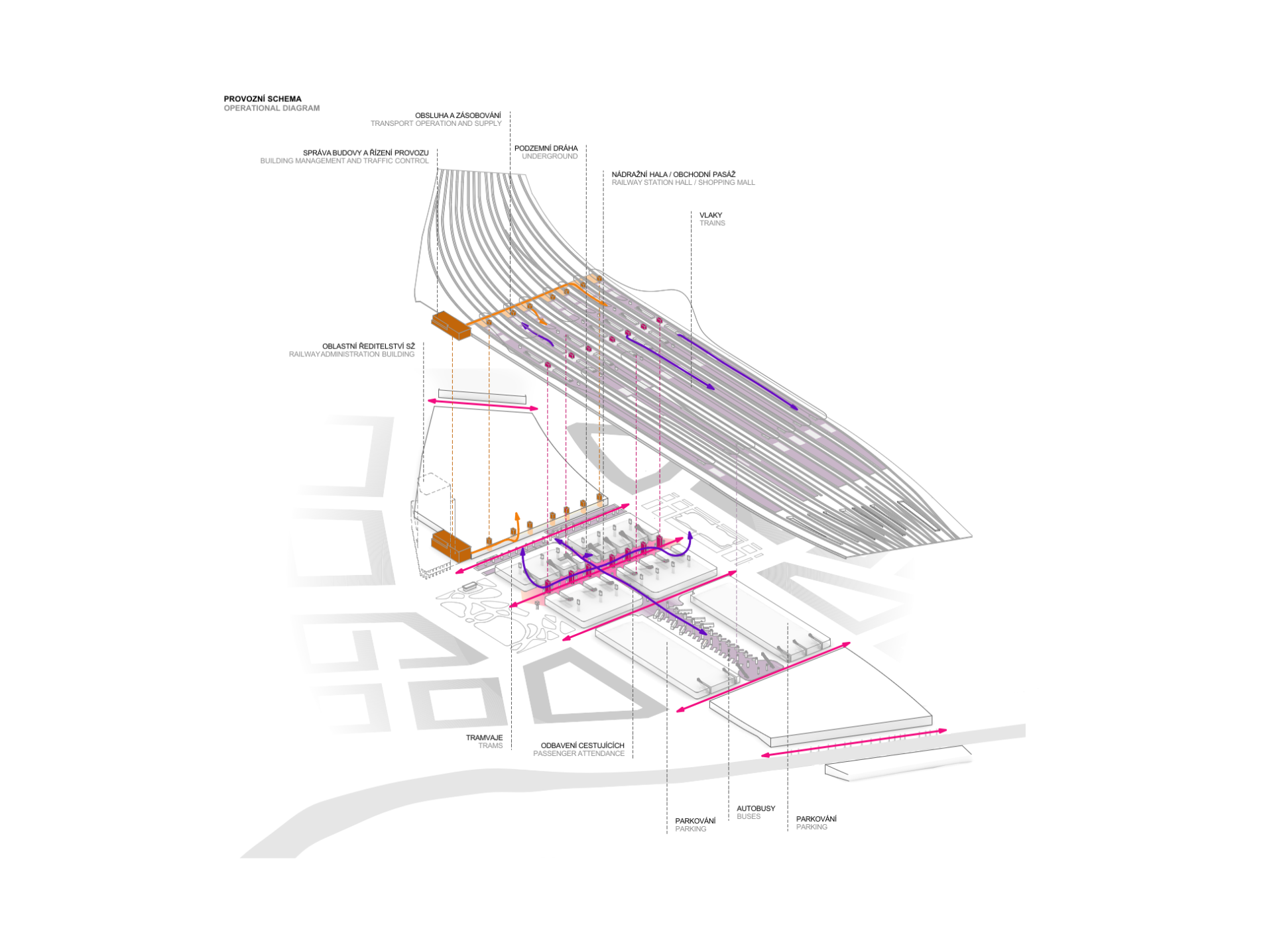
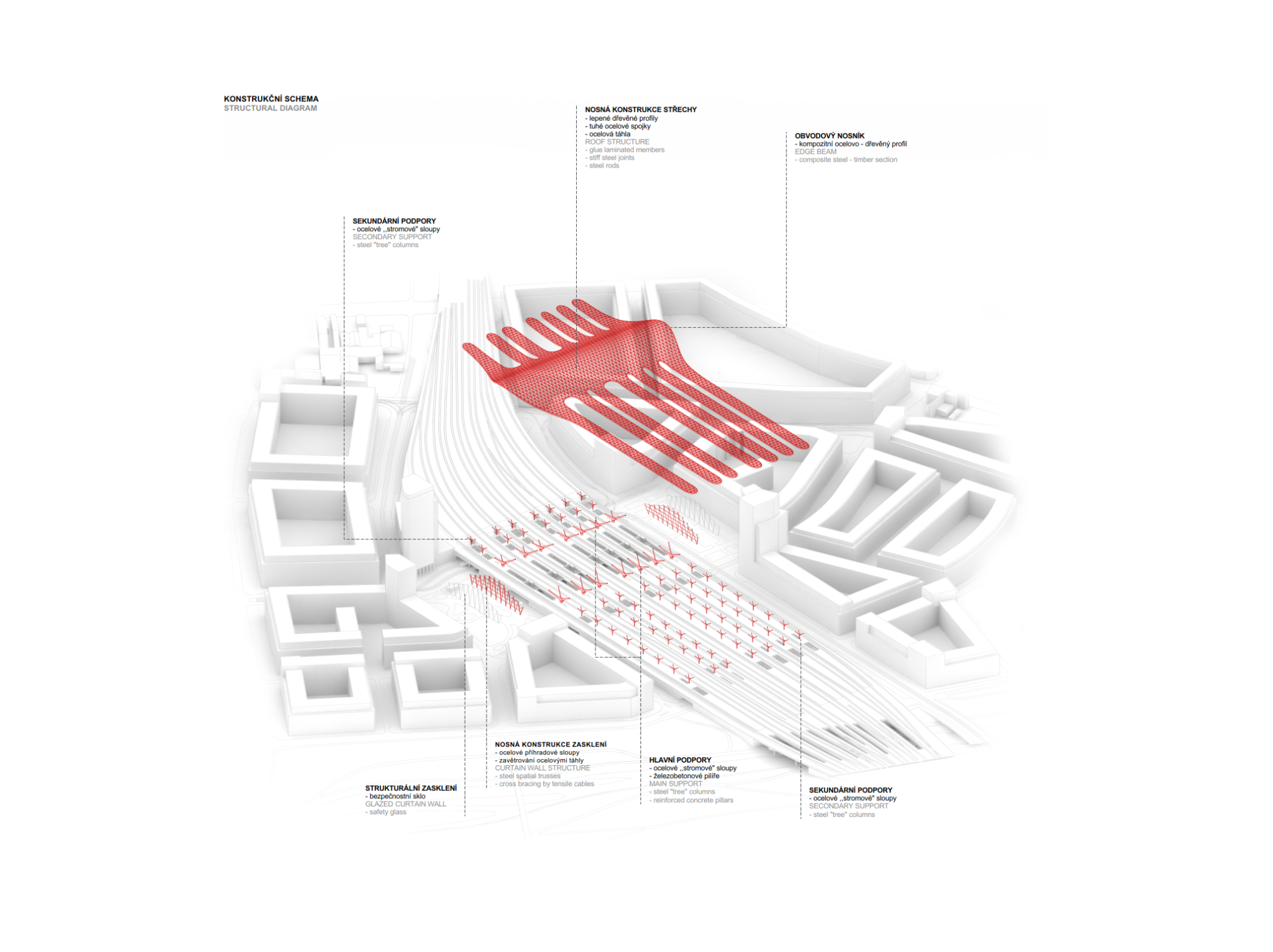
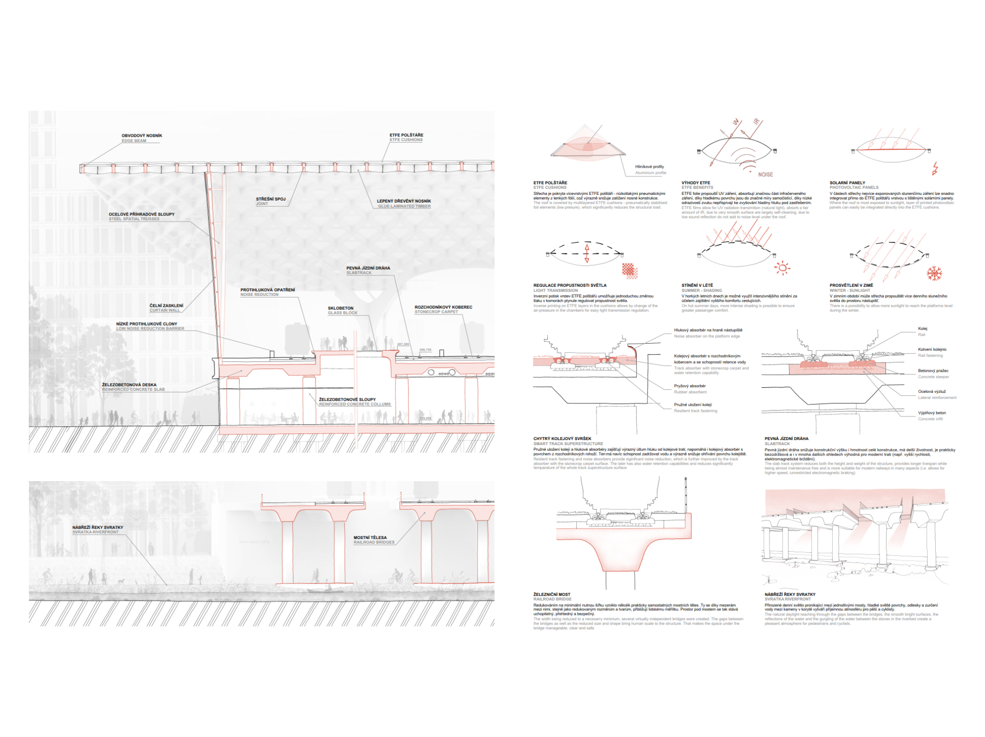
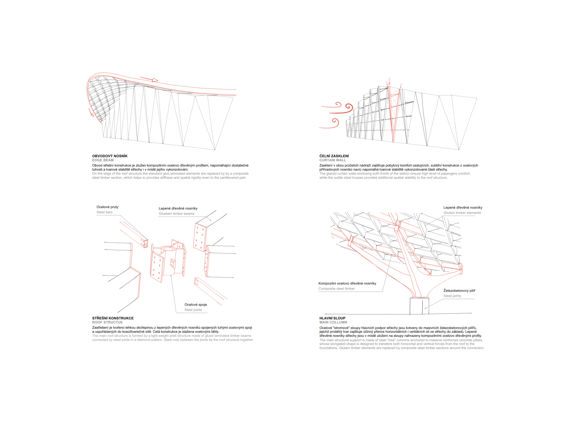
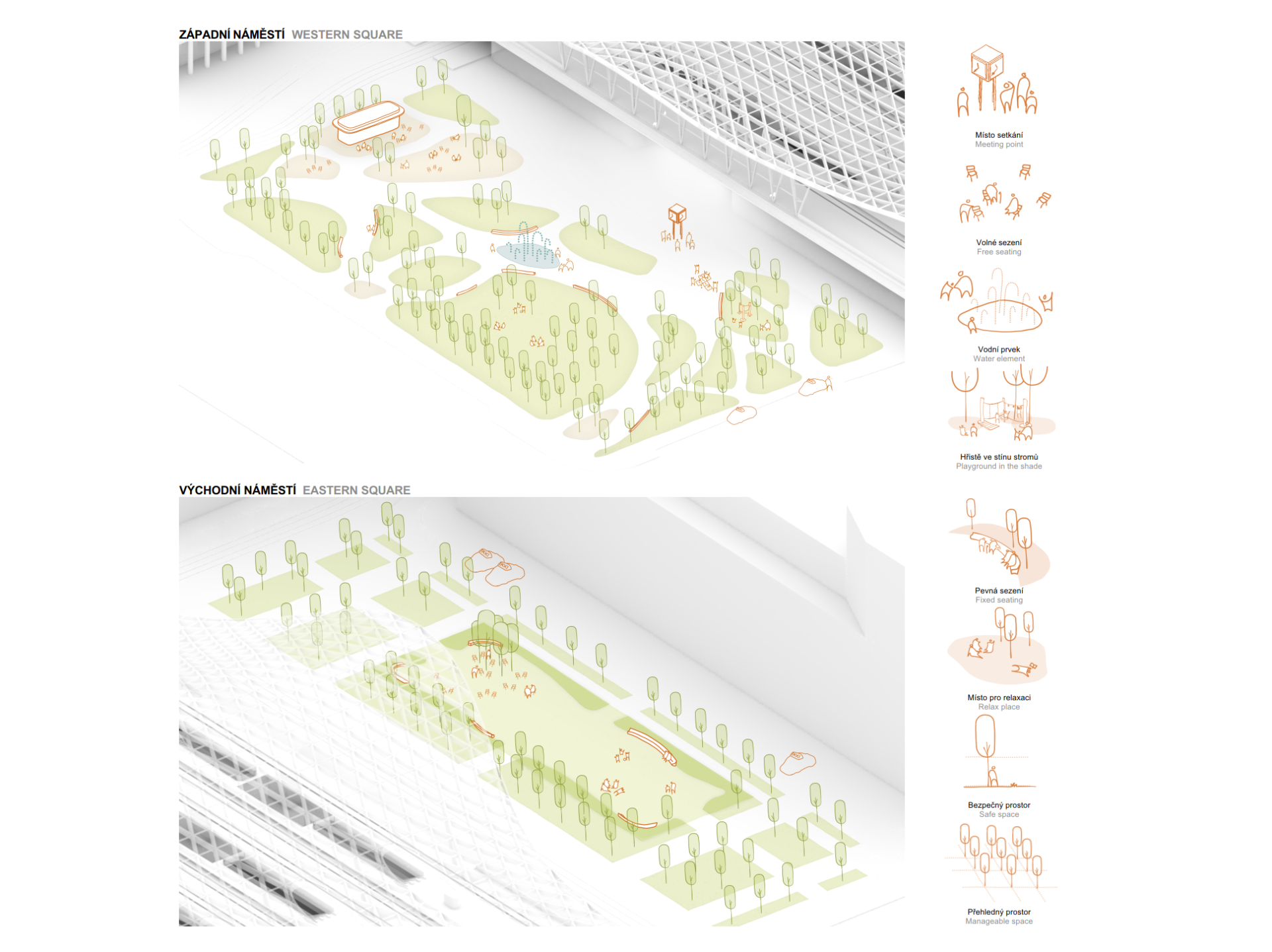
Our main goal is to use the urbanizing potential of the station so that the parts of the new South Quarter divided by rail are connected into an urban entity. The basic quality of the design is its simplicity. The station is a separate building, a clearly defined investment. The city “grows” up to it on its own land (with the economic effect of increasing the area of city and Czech Railways building plots and reducing the burden of maintenance of unnecessary areas). The station is oriented towards the new district with both its analogous facades, so it does not have a front and a back, so it does not divide, but rather connects the urbanized areas on both sides. It is a centre of the new district to which it opens through two plazas, into which the surrounding streets converge. From here, the adjoining texture of the city is woven. The plazas are connected by a covered pedestrian passage, which is both the main public area of the station and a busy city area. The theme of interconnection is the guiding idea of the station, whose leading architectonic motive – the roof cover – at the point of communication interconnection takes the form of a city gallery, which acts as a funnel that conducts current and allows overflowing from one vessel to another. At the same time, the emphasis which the design places on interconnection also shapes the station as a compact traffic and interchange junction with short interchange distances and good orientation, resulting in greater comfort of all passengers and users. The requirement of unambiguity and transparency with an emphasis on intuitive orientation determines the layout of routes and platform of the individual transportation types, direction of movement, placement of corridors and communication interconnections and cores, and thus the basic concept of the station make-up as a multimodal traffic terminal. The architectural form of the station is equally simple and understandable. It consists only of the body of the tracks and the roof, its curvature being not only a metaphor of movement, but also forming the typological emblem of the station hall and the shape of the roofs of city galleries – the glass vault of covered streets – which clearly signals the station core and at the same time symbolizes the connection of both sides of the city. The simple and unambiguous arrangement of spaces, operations and shapes brings an easy orientation, interconnection, proximity, and safety, as well as investment and operational savings to the design. Being a large city park, the area along the Svratka river together with the new park plazas offer attractive recreational spaces in the city centre and at the same time they significantly contribute to the improvement of the climate.
